Executive Dashboard
for Managing a Federal-Scale Delivery Business
Lead Designer
JetStyle, 2023 - 2025

Context
1
Regional directors and department heads received business data as printed reports — once a month, two days of preparation, stale by the meeting. The brief was one sentence: digitize the reporting. No user access — everything went through an intermediary.
Without direct research, I reconstructed requirements from the report structure itself: which metrics appeared together, what conclusions they implied, what decisions a manager would make. This produced four use cases: morning status check, situational analysis, geographic overview, background trend monitoring. These determined screen hierarchy and the product's core feel — a monitoring instrument, not a report viewer.
My Role
2
- Analyzed existing reporting structure to reconstruct user needs without direct user access
- Defined information architecture and use case scenarios for the product
- Designed the complete UI across several dozen screens
- Built the design system for analytical interfaces, including both light and dark themes
- Oversaw implementation through to launch
Design Decisions
3
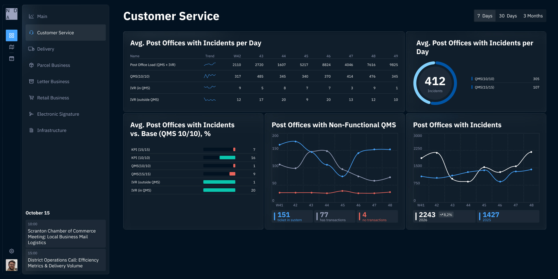
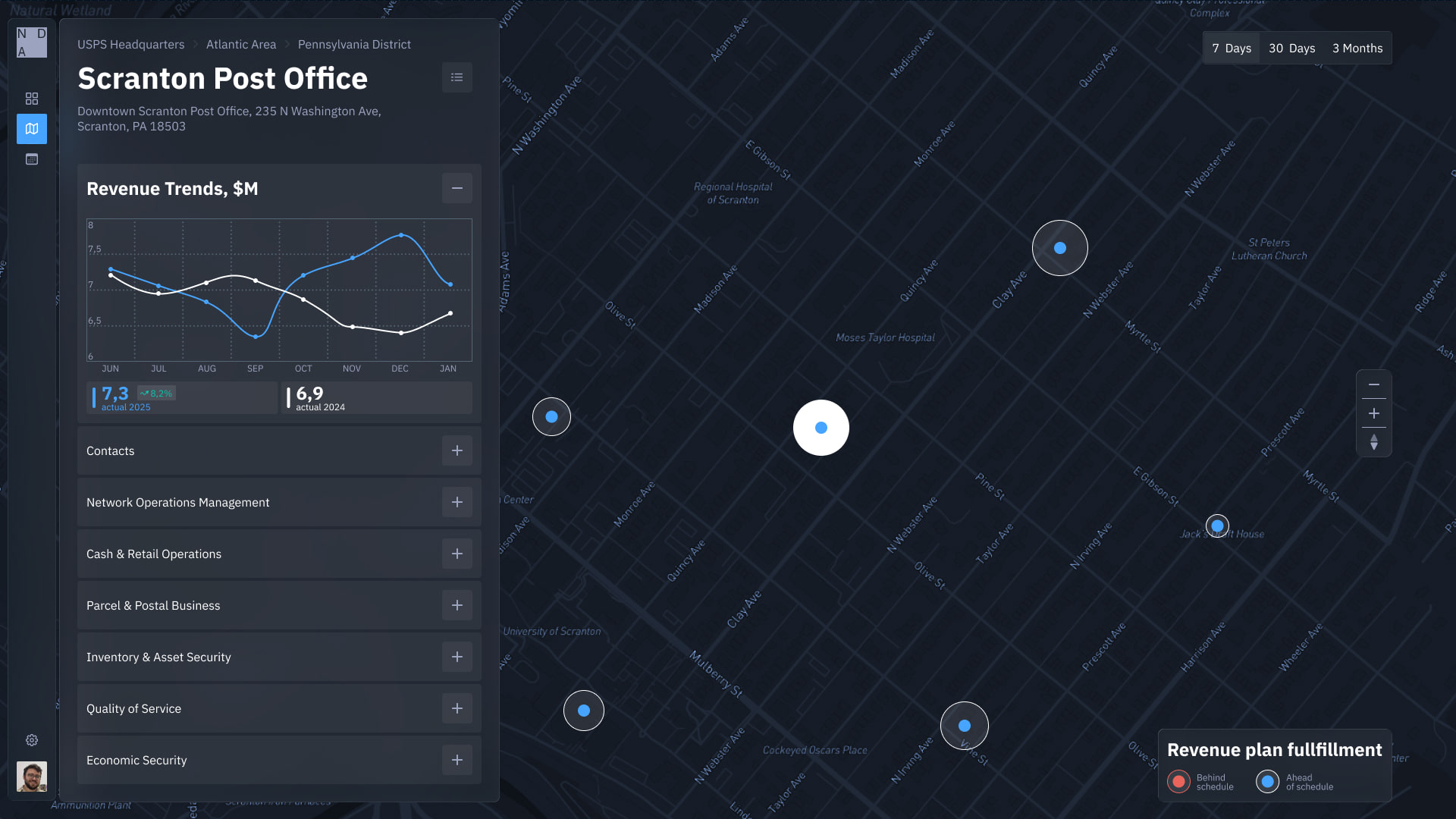
Clipping by delta, not from zero — indicators move in a 2–5% range; a zero-based Y-axis makes that invisible. Clipping to the actual range immediately surfaced dynamics that previously looked like a flat line.
Sparklines instead of tables — with thousands of branches, row-by-row reading is impossible. I replaced numeric columns with mini-charts: trend and anomalies visible at a glance without losing precision.
Map as a primary layer — the initial concept had the map as secondary. I pushed to make it equal to tabular data. For managers running physical territory across an entire country, geography is the primary frame: a complaint spike in Novosibirsk reads differently than the same spike in Moscow. Elevating the map shifted the mental model from table to territory — the most significant structural decision in the product. I designed distinct zoom levels (country → region → city) and used web map JSON specs to align its visual language fully with the design system.
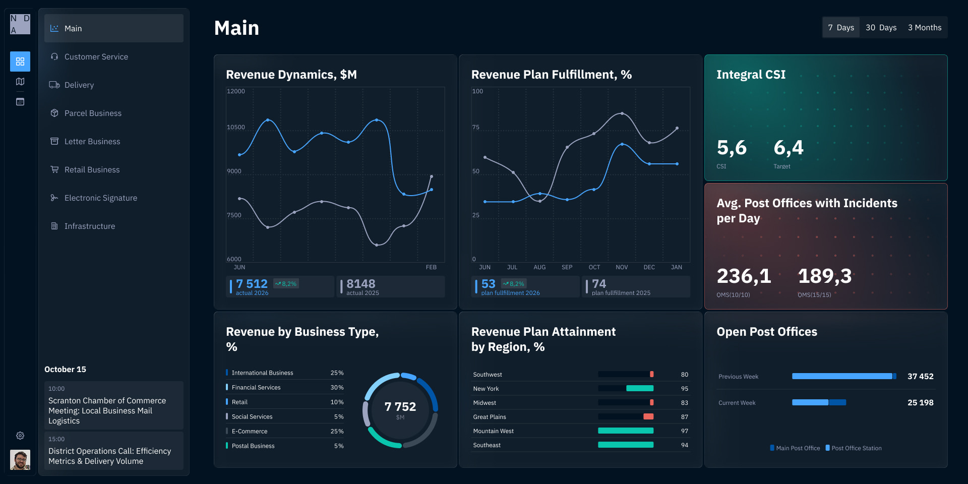
Attention management — reporting period visually emphasized; critical indicators highlighted by size and color relative to norm; details one click deeper.
Design Strategy
4
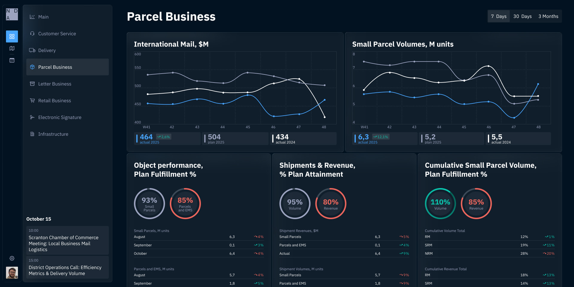
Several dozen screens across different business areas required a system built in parallel with the product, not after. Widgets as building blocks — same components assemble different reporting pages.
Key decisions:
- Empty states for every widget — uneven data coverage had to look intentional, not broken
- Normalized positioning — layout holds regardless of widget fill level
- Light and dark themes — dark was a functional requirement: large screens in meeting rooms, evening use
- Tablet and large-screen responsiveness — the audience's primary devices
Results
5
| Before | After |
|---|---|
| Report once a month, 2 days of preparation | ✅ Available continuously, preparation is JSON upload (automated) |
| Data was stale by the time of the meeting | ✅ Current state at any moment |
| No filtering by period | ✅ Arbitrary date range, always in the interface |
| Tables with no geographic context | ✅ Map as an equal data layer |
| Dynamics invisible | ✅ Trends readable without row-by-row analysis |
The most important change didn't happen in the interface — it happened in the decision-making cycle. Information stopped existing as a monthly document and became a permanently available layer of business management. Managers moved from a retrospective ritual to continuous awareness. That's the actual outcome.